Airplane Boarding Pass Redesign

There are many limitations and restrictions to the production of boarding passes, which inhibits effective design elements. Upon research, I learned that special printers are required to print boarding passes. These printers only support a limited number of fonts, which restrict the use of fancy fonts. Due to ink limitations, passes should limit color and large quantities of black.
I gave myself these same constraints in my attempt at redesigning this product. I attempted to utilize white space, hierarchy, size, and line weight effectively to create a well-designed product under these restrictions.
To create a hierarchy, I organized and explained each element's reasoning from my personal experiences of traveling. To me, I use the left-side of the pass for pre-boarding and the right-side for post-boarding.
For the pre-boarding section, I grouped the information into three sections; main usage, additional information, and technical information.
Additional Information
Flight Number*
Date
Origin and Destination
I chose flight number as the most important in the additional information group because I send this number to friends or I search it up myself to find real-time information.
Main Usage
Checking time
Finding gate
Checking seat zone to stand in correct line
Finding my seat
This is my chronological order of how I use the information on my boarding pass from checking in to boarding the plane.

Technical Information
Additional information needed for airport staff
TSA Precheck
DOCS-OK
ETC.
Since Main Usage is the most important on the hierarchy, I made sure to surround it in white space to create contrast. I also changed the line weight of the vital information such as time and gate to make it stand out. I then grouped Additional Information together in a grid system to make it organized and easy to read. Lastly, I placed all the Technical Information at the top right corner. This placement is easy to read for the airport staff and is away from the rest of the user’s information.
For the post-boarding section, I numbered the information from most important to least.
Post-Boarding Section
Finding seat
Filling out immigration or other forms
Flight number
Date
Origin and Destination
Finding Bags -> number of bags
Additional information
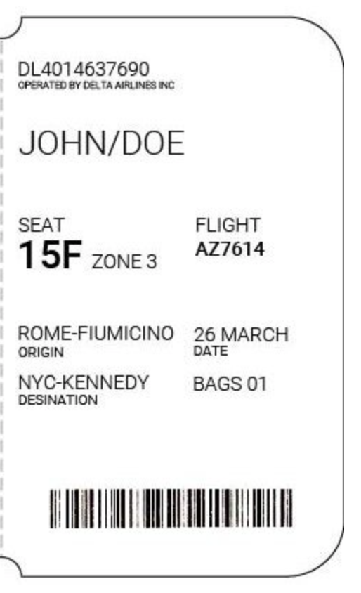
The post-boarding section is basically a small stub that you need to find your seat and reference for future uses. Using my list as a base, I used varying line weights to show importance. I decided that the date and origin/destinations were less important than the flight number because the user should know where they boarded and where they are arriving whereas the flight number is a series of numbers and letters that the user cannot get wrong.


