Designing Desktop/Mobile Layout
Using Figma, created reactive layouts for the desktop and mobile.
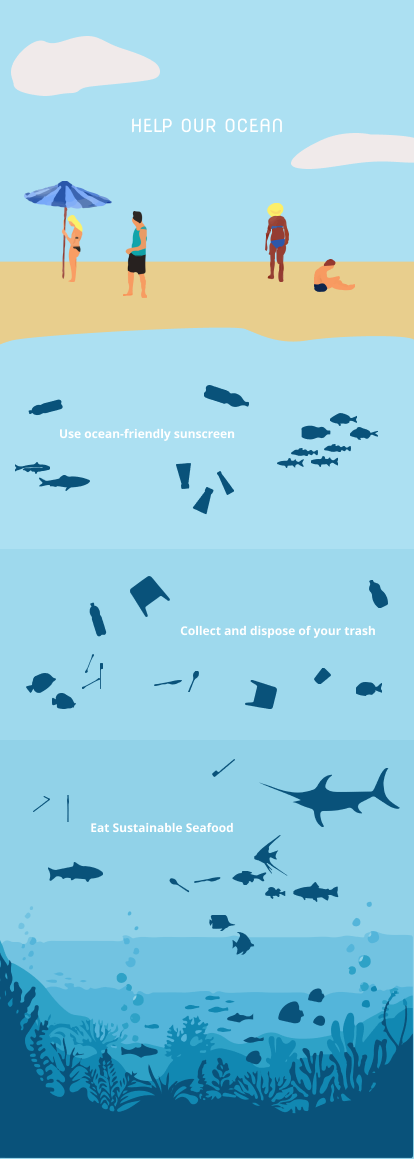
Wanted to focus on user interactions on a website.
Scrolling, clicking, swiping, zooming
Decided on scrolling effect to represent going down the ocean.
Desktop Version

Mobile Version
For the desktop version, created wider elements.
For the mobile version, created taller elements.
For future implementations, I want to do more research to find interesting and engaging facts that the audience might not know.